OSMO - Homepage
We work alongside our clients to build projects that can change their tomorrow - defining clear objectives, enhancing knowledge and research, introducing new paradigms, and building awareness.
Studies suggests that the average website visitor will only read about 18% of the words on your site. Let's make them count.
Below are a selection of websites I've helped businesses create.
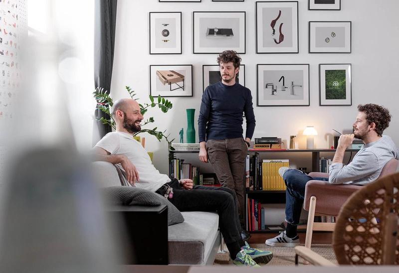
A strategy and design studio with an elegant, innovative brand. OSMO's beautiful visual identity means that the surrounding copy is very much a supporting player. My aim was to ensure their modern, intellectual approach was captured within their website copy.
Distilling complex payment processes into digestible copy was always going to be a challenge. However, in collaboration with an excellent design team we created a visually interesting and concise site which spoke directly to specific markets.
Tone can rarely be more important than when working for medical and therapeutic services. We knew that people coming to the site would be doing so from wildly different experiences. Some simply wanted to maintain their mental wellbeing whereas others had serious undiagnosed mental difficulties that they felt they needed to address. We attempted to create a tone that was, above all, welcoming and understanding.
Atscale target businesses that are transitioning between scale-up to enterprise. Their target audience has a clear goal and the site needed to reassure them that Atscale was the right partner to help them achieve it. The language is direct and authoritative, speaking to their belief in their offering and the likely time-poor nature of their site visitors.